Most elements have 4 possible states : 'normal', 'pressed', 'hover' and 'locked'.
Each state is linked to a behaviour and a style (see the examples).
The style options are not indicated in the documentation of the elements, as they are extensively
covered in the examples.
Getters and setters functions of all the elements are not covered when they are obvious (e.g) get_value for TextInput returns a string containing the inserted input.
Styling of the elements is extensively covered in the examples, as well as in the docs for themes.
See the most useful methods of any elements (e.g. set_size, move, etc) in the docs for common elements methods.
Or click on an image below (not all elements are present here):
 (Button)
 (Group)
 (Text)
 (OutlinedText)
 (Box)
(Box)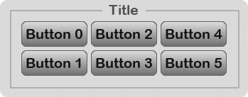 (TitleBox)
 (AlertWithChoices)
 (Alert)
 (TextInput)
 (DropDownListButton)
 (SliderWithText)
 (Helper)
 (ColorPicker)
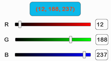 (ColorPickerRGB)
 (ColorPickerPredefined)
 (TogglablesPool)
 (Checkbox)
 (Radio)
 (SwitchButton)
 (ImageButton)
 (Line)
 (DiscreteLifebar)
 (Lifebar)
 (WaitingBar)
 (TkDialog)
 (HeterogeneousTexts)
Getters and setters functions of all the elements are not covered when they are obvious (e.g) get_value for TextInput returns a string containing the inserted input.
Styling of the elements is extensively covered in the examples, as well as in the docs for themes.
See the most useful methods of any elements (e.g. set_size, move, etc) in the docs for common elements methods.
Go to section:
Alert|AlertWithChoices|AnimatedGif|ArrowButton|Box|Button|Checkbox|ColorPicker|ColorPickerPredefined|ColorPickerRGB|DeadButton|DiscreteLifebar|DropDownListButton|Group|Helper|HeterogeneousTexts|Image|ImageButton|Labelled|LabelledColorPicker|Lifebar|Line|OutlinedText|Radio|ShowFPS|Slider|SliderWithText|SwitchButton|SwitchButtonWithText|Text|TextAndImageButton|TextInput|TitleBox|TkDialog|TogglablesPool|ToggleButton|WaitingBarOr click on an image below (not all elements are present here):
 (Button)
 (Group)
 (Text)
 (OutlinedText)
 (Box)
(Box) (TitleBox)
 (AlertWithChoices)
 (Alert)
 (TextInput)
 (DropDownListButton)
 (SliderWithText)
 (Helper)
 (ColorPicker)
 (ColorPickerRGB)
 (ColorPickerPredefined)
 (TogglablesPool)
 (Checkbox)
 (Radio)
 (SwitchButton)
 (ImageButton)
 (Line)
 (DiscreteLifebar)
 (Lifebar)
 (WaitingBar)
 (TkDialog)
 (HeterogeneousTexts)
Button
Standard button that can be clicked by the user to execute an action.
Mandatory arguments
text : text of the button shown to the user.
Optionnal arguments
generate_surfaces can be set to False if you plan to change the style of the button before displaying it. Default value = True
children elements can be given to the button. Default value = None
all_styles_as_normal forces all styles to be the same as style_normal. You can specify the style of the button with the styles arguments, though carefully setting the theme of your menu is probably a better solution. Default value = False
Tagged examples: button_helloworldguess_the_numberlook_tuneshowcase_themesshowcase_themes2showcase_themes_buttons
set_text(self, text, adapt_parent=True, only_if_different=True, max_width=None)
Regenerate element's surfaces with new text content.
Mandatory arguments
text : the new text.
Optionnal arguments
adapt_parent : if True, then parent's size is adapted according to its last imposed margins.
only_if_different : set to True if you want the element's surfaces to be regenerated only when the new text is different than the current element's text.
max_width : set to True to automatically insert line breaks. This width is then the whole element's width, including its margin.
Tagged examples: guess_the_numbertext_width
Group
Invisible element containing some children elements.
Mandatory arguments
elements : children of the group.
Optionnal arguments
mode : "v", "h", "grid" or None. Specify None if you do not want to sort elements. Default value = "v"
margins : 2-tuple of integers for x- and y-margins (in pixels) Default value = (5,0)
gap : integer value for the spacing between elements (in pixels) Default value = 5
nx : number of columns if grid mode is used, or 'auto' Default value = "auto"
ny : number of lines if grid mode is used, or 'auto' Default value = "auto"
align : alignement of the choices in the list. Either 'center' (for both vertical and horizontal mode) or 'left', 'right' (for horizontal mode) or 'top', 'bottom' (for vertical mode) Default value = "center"
Tagged examples: colorpickergroupinggrouping_without_sortinggroups_of_groupsguess_the_numbershowcase_themesshowcase_themes2showcase_themes_buttonsslider
stick_to(self, other, self_side, other_side, delta=(0,0), move_x=True, move_y=True)
Sticks the element to another.
Mandatory arguments
other : another element or pygame surface.
self_side : side of the element beeing sticked. Can be 'left', 'right', 'top' or 'bottom'.
other_side : side of the other element. Can be 'left', 'right', 'top' or 'bottom'.
Optionnal arguments
delta : 2-tuple delta (pixels) to apply after the element has been moved.
move_x : (bool) set to False if x-axis movement should be ignored.
move_y : (bool) set to False if y-axis movement should be ignored.
Text
Text that can be used as a GUI element taking all standard element states (normal, hover, pressed, locked) and actions.
Mandatory arguments
text : the text content. Can include line breaks.
Optionnal arguments
font_size : size of the font (integer). Default value = None
font_color : color of the font in (R,G,B) format. Default value = None
max_width : maximum widht of the text element. To cope with tate, line breaks will be automatically inserted if needed. Default value = None
Tagged examples: image_with_textlabelsrich_textshowcase_themesshowcase_themes2showcase_themes_buttonstext_outlinertext_widththeme_outlined
OutlinedText
Outlined text that can be used as a GUI element taking all standard element states (normal, hover, pressed, locked) and actions.
Mandatory arguments
text : the text content. Can include line breaks.
Optionnal arguments
font_size : size of the font (integer). Default value = None
font_color : color of the font in (R,G,B) format. Default value = None
outline_color : color of the outline in (R,G,B) format. Default value = None
outline_thickness : (int) thickness of the outline in pixels. Default value = None
max_width : maximum widht of the text element. To cope with tate, line breaks will be automatically inserted if needed. Default value = None
Tagged examples: text_outlinertheme_outlined
Box
Graphical box that contains children elements.
Mandatory arguments
children : children elements of the box.
Optionnal arguments
sort_immediately : set to False if you do not want to sort the elements. May be useful if you plan to sort them later and performance is critical. Default value = True
scrollbar_if_needed : set to True if you want a scrollbar to automatically pop when content exceeds a given size. Otherwise, the size of the box adapts. Default value = False
size_limit : 2-tuple of integers representing the size limit. Any of these integers can be replaced by 'auto' to let Thorpy decide. Default value = "auto"
set_resizable(self, x, y, clip_children=True)
Set the box resizable by the user by dragging the corner and/or the borders.
Mandatory arguments
x : (bool) set resizable along x-axis.
y : (bool) set resizable along y-axis.
Optionnal arguments
clip_children : (bool) clip children elements inside the box.
Set the box resizable by the user by dragging the corner and/or the borders.
Mandatory arguments
x : (bool) set resizable along x-axis.
y : (bool) set resizable along y-axis.
Optionnal arguments
clip_children : (bool) clip children elements inside the box.
is_resizable(self)
Returns True if the box is resizable on any axis.
Returns True if the box is resizable on any axis.
TitleBox
Graphical box that contains children elements and displays a title.
Mandatory arguments
text : title of the box.
children : children elements of the box.
Optionnal arguments
sort_immediately : set to False if you do not want to sort the elements. May be useful if you plan to sort them later and performance is critical. Default value = True
scrollbar_if_needed : set to True if you want a scrollbar to automatically pop when content exceeds a given size. Otherwise, the size of the box adapts. Default value = False
size_limit : 2-tuple of integers representing the size limit. Any of these integers can be replaced by 'auto' to let Thorpy decide. Default value = "auto"
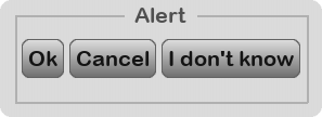
AlertWithChoices
Alert popping to the screen and allowing the user to choose among choices.
Mandatory arguments
title : string displayed as the title of the alert.
choices : a sequence containing strings or elements (like in a DropDownListButton).
Optionnal arguments
text : supplementary text displayed above the choices. Default value = None
choice_mode : either 'h' or 'v'. Default value = "h"
children : either None or a list of elements or a string. Default value = None
bck_func : either None or a function. Default value = None
overwrite_choices : if True, then if buttons are passed as choices, their at_unclick and at_unclick_params are overwritten. Default value = True
get_button(self, choice_str_or_index)
Return the choice button corresponding to the passed arg.
Mandatory arguments
choice_str_or_number : either a string corresponding to the content of the button we want to get, or an integer representing the index of the choice.
Return the choice button corresponding to the passed arg.
Mandatory arguments
choice_str_or_number : either a string corresponding to the content of the button we want to get, or an integer representing the index of the choice.
set_choice_func(self, choice_str_or_index, func, params=None)
Redefine the function to be called when clicking on a given choice.
Mandatory arguments
choice_str_or_number : either a string corresponding to the content of the button we want to get, or an integer representing the index of the choice.
func : the function to be called.
Optionnal arguments
params : (dict) arguments passed to the function.
get_value(self)
Return the choice made by the user, after the alert with choices has been launched ! The value is None if user has not chosen yet or if the alert has been cancelled by the user.
Return the choice made by the user, after the alert with choices has been launched ! The value is None if user has not chosen yet or if the alert has been cancelled by the user.
Tagged examples: get_value_from_elements
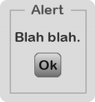
Alert
Alert popped to the screen and displaying a message.
Mandatory arguments
title : string displayed as the title of the alert.
text : supplementary text displayed above the choices.
Optionnal arguments
ok_text : text of the 'okay' button to remove the alert. Default value = "Ok"
bck_func : either None or a function. Default value = None
children : either None or a list of elements or a string. Default value = None
TextInput
Alert popping to the screen and displaying a message. Most of the customization parameters are meant to be set after initialization. Have a look at the example of TextInput !
Mandatory arguments
text : string displayed on the left of the input.
Optionnal arguments
placeholder : text of the placeholder (empty by default). Default value = ""
on_validation(self)
Function to be called when user validates a text. Redefine it as you like.
Function to be called when user validates a text. Redefine it as you like.
Tagged examples: textinput_direct_launch
set_only_numbers(self)
Set the text input to accept only numbers (float).
Set the text input to accept only numbers (float).
set_only_integers(self)
Set the text input to accept only integers.
Set the text input to accept only integers.
set_only_alpha(self)
Set the text input to accept only alphabetical chars.
Set the text input to accept only alphabetical chars.
set_accept_all(self)
Set the text input to accept any type of string.
Set the text input to accept any type of string.
direct_launch(self, element=None)
Launch the text input to the screen without asking the user to press a button, and directly put the focus on it. This allows you to provide the user a more direct way that opening an alert, inserting the text and then clicking 'Ok' or 'Cancel' button. See the examples.
Launch the text input to the screen without asking the user to press a button, and directly put the focus on it. This allows you to provide the user a more direct way that opening an alert, inserting the text and then clicking 'Ok' or 'Cancel' button. See the examples.
Tagged examples: textinput_direct_launch
DropDownListButton
When this button is clicked, a list of choices is displayed to the user, who can choose one of them (or none) to close the list. Caution, get_value() will return None until user choses an option.
Mandatory arguments
choices : sequence of strings or elements.
Optionnal arguments
title : text to display on the button to launche the list of choices. Default value = None
show_value : (bool) display the last chosen value as the title of the button. Default value = True
choice_mode : either 'v' or 'h' (vertical or horizontal). Default value = "v"
align : alignement of the choices in the list. Either 'center' (for both vertical and horizontal mode) or 'left', 'right' (for horizontal mode) or 'top', 'bottom' (for vertical mode) Default value = None
gap : (int) space between two choice in the list (in pixels). Default value = 5
all_same_width : (bool) forces each choice button to be the same width as the others. Default value = True
bck_func : function to be called each frame when menu is launched in blocking mode. If None, Thorpy will call the global call_before_gui function that has been set. Default value = None
click_outside_cancel (bool) : set to False if at least one element of the list must be chosen. Default value = True
launch_nonblocking (bool) : set to True if you want to launch the list in non-blocking mode. Default value = False
overwrite_choices : (bool) if True, the behaviour of the potential elements passed in choices is shadowed. Default value = True
size_limit : 2-tuple of integers to define the maximum size of the box in which choices are displayed. Default value = ("auto","auto")
generate_shadow : 2-tuple whose first value is a boolean stating whether a shadow should be generated for the list, and whose second value is either 'auto' or a boolean stating whether the shadow generation should be done in fast mode. Default value = (True,"auto")
Tagged examples: dropdownlistshowcase_themesshowcase_themes2showcase_themes_buttonsuser_chooses_font
SliderWithText
Provides a way for the user to pick a value in a given range like a normal slider, plus textual indications.
Mandatory arguments
text : string displayed on the left side of the slider.
min_value : minimum value of the slider.
max_value : maximum value of the slider.
initial_value : initial value of the slider (must be in the range you chose)
length : length of the slider bar along the axis defined by the mode.
Optionnal arguments
mode : either 'h' (horitontal) or 'v' (vertical). Default value = "h"
show_value_on_right_side : (bool) dynamically display (or not) the current value on the right side of the slider. Default value = True
round_decimal : (bool) used to round the result (e.g. round_decimals=2 will give results with 2 decimals). By default it is set to -1 ; in this case the result is an integer.
show_value_on_cursor : (bool) used to display the value on the slider's dragger. This is experimental for now and may cause issues, especially regarding the initial value of the slider. Default value = False
thickness : thickness of the slider bar. Default value = 5
set_when_click : (bool) set the value when user click the slider's bar (instead of the cursor) Default value = True
dragger_height : (int or 'auto') length of the dragger in pixels.
dragger_length : (int or 'auto') height of the dragger in pixels.
edit : (bool) set to False if you want to forbid that user insert text to edit the value.
on_text_validation(self)
Redefine this method to launch a function at text validation.
Redefine this method to launch a function at text validation.
Helper
Text that pops when user is hovering another element. Typically used to display hints to the user.
Mandatory arguments
text argument is the text shown to the user.
parent element that triggers the helper when hovered for a given amount of time.
Optionnal arguments
countdown : time in frames before the helper pops when user is hovering the linked element (i.e. self.parent) Default value = 30
generate_shadow : 2-tuple whose first value is a boolean stating whether a shadow should be generated for the list, and whose second value is either 'auto' or a boolean stating whether the shadow generation should be done in fast mode. Default value = (True,"auto")
offset : offset of the helper from the mouse position (in pixels) Default value = (0,-20)
max_width : maximum width of the helper before line breaks are automatically inserted. Can be None for infinite. Default value = None
follow_mouse : (bool) set to True if you want the help to follow the mouse when hovering the parent. Default value = False
Tagged examples: helper
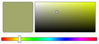
ColorPicker
Allows the user to pick a color in a pseudo continuum of colors.
Optionnal arguments
mode : either 'google', 'red', 'green' or 'blue'. Default value = "google"
initial_value : initial color of the color picker. Experimental : may not be very accurate in some cases. Default value = (255,0,0)
slider_align : either 'h' or 'v' for horizontal or vertical slider bar. Default value = "h"
length : length of the color frame in which user can click. Default value = None
height : height of the color frame in which user can click. Default value = None
thickness : thickness of the colorbar (slider bar). Default value = None
show_rgb_code : (bool) display the RGB code of the selected color on the thumbnail. Default value = True
colorframe_size : 2-tuple indicating the size of the colorframe in pixels. Default value = None
colorbar_length : length of the colorbar (slider) in pixels. Default value = None
ColorPickerRGB
Allows the user to pick a color in a pseudo continuum of colors, by choosing the red, green and blue values independantly.
Optionnal arguments
initial_value : initial color of the color picker. Default value = (255,0,0)
slider_align : either 'h' or 'v' for horizontal or vertical slider bar. Default value = "h"
length : length of the slider bars for red, green and blue. Default value = 256
thickness : thickness of the colorbar (slider bar). Default value = None
show_rgb_code : (bool) display the RGB code of the selected color on the thumbnail. Default value = True
colorframe_size : 2-tuple indicating the size of the colorframe in pixels. Default value = "auto"
ColorPickerPredefined
Allows the user to pick a color in a discrete set of colors, potentially predefined by you.
Optionnal arguments
colors : a sequence of predefined colors. If set to None (or by default), this sequence will automatically be populated by Thorpy. Default value = None
mode : either 'grid, 'h' or 'v'. This defines the way the colours are sorted and displayed. Default value = "grid"
nx : number of columns (int) or 'auto'. Default value = "auto"
ny : number of lines (int) or 'auto'. Default value = "auto"
auto_cols_steps : if colors sequence is None, then this is the number of steps used to auto populate it. Default value = 0
manual_cols_step : if colors sequence is None and auto_cols_steps is zero, then this is the step used to populate the color sequence. Default value = None
col_size : 2-tuple indicating the size of the choice buttons. Default value = (30,30)
init_color_index : index of the initial color. Default value = 0
Labelled
Associate itself another element, on the left side of which a label text is displayed.
Mandatory arguments
label : a string defining the label of the element.
element : the element to labellize.
Optionnal arguments
cls_label : a Thorpy element class to be used as the label. Default value = None
Associate itself another element, on the left side of which a label text is displayed.
Mandatory arguments
label : a string defining the label of the element.
element : the element to labellize.
Optionnal arguments
cls_label : a Thorpy element class to be used as the label. Default value = None
LabelledColorPicker
Forms a group with a color picker, on the left side of which a label text is displayed.
Mandatory arguments
label : a string defining the label of the element.
element : the colorpicker to labellize.
Optionnal arguments
ok : string of the validation text Default value = "Ok"
cancel : string of the cancellation text Default value = "Cancel"
color_size : 2-tuple for the size of the color thumbnail Default value = (20,20)
launch_mode : either 'launch_nonblocking' or 'launch_blocking' or 'launch_alone' Default value = "launch_alone"
func_before : the function to call before drawing self when launched. Default value = None
Tagged examples: colorpicker
TogglablesPool
Provides a way for the user to switch between different, predefined values. Only one value at a time can be chosen. Each value is represented by a togglable button. When a button is pressed, all the others are unpressed.
Mandatory arguments
label : string displayed on the left side of the switches.
choices : sequence of strings.
initial_value : text of the initial value chosen.
togglable_type : (str) either 'toggle', 'radio' or 'checkbox'. Default value = "toggle"
Tagged examples: togglables_pool
get_value(self)
Returns the text of the chosen element.
Returns the text of the chosen element.
Tagged examples: get_value_from_elements
get_choice_button(self, text)
Returns the choice element corresponding to the text given as argument.
Returns the choice element corresponding to the text given as argument.
TextAndImageButton
Button formed of both a text and an image as separate elements. Useful when user may not know what the items in a list look like, e.g. typically for inventory lists in games.
Mandatory arguments
text : string to display
img : pygame surface
Optionnal arguments
mode : "h", "v" for horizontal or vertical Default value = "h"
reverse : (bool) if True, then image comes first and the text is displayed on its right side. Default value = False
cls : Thorpy element class to make the button. By default cly = thorpy.Button. Default value = Button
margins : 2-tuple of integers for x- and y-margins (in pixels) Default value = (5,5)
Tagged examples: image_with_text
ToggleButton
Button than stays pressed when user click on it and returns to normal state only after it is clicked again. This is typically used to model on/off options.
Mandatory arguments
text : text of the button shown to the user.
Optionnal arguments
value : initial value. Set to False for normal state or True for pressed state. Default value = False
toggle(self)
Use this method to toggle the state (normal to pressed or pressed to normal)
Use this method to toggle the state (normal to pressed or pressed to normal)
Checkbox
Checkbox that can be (un)checked by the user to model an on/off interaction.
Optionnal arguments
value : initial value. Set to False for unchecked or True for checked. Default value = False
size : 2-tuple indicating the size of the element in pixels, or 'auto' for auto size. Default value = "auto"
Checkbox that can be (un)checked by the user to model an on/off interaction.
Optionnal arguments
value : initial value. Set to False for unchecked or True for checked. Default value = False
size : 2-tuple indicating the size of the element in pixels, or 'auto' for auto size. Default value = "auto"
Radio
Radio button that can be (un)checked by the user to model an on/off interaction.
Optionnal arguments
value : initial value. Set to False for unchecked or True for checked. Default value = False
size : 2-tuple indicating the size of the element in pixels, or 'auto' for auto size. Default value = "auto"
SwitchButton
Switch button that can be (un)checked by the user to model an on/off interaction.
Optionnal arguments
value : initial value. Set to False for unchecked or True for checked. Default value = False
size : 2-tuple indicating the size of the outer switch in pixels, or 'auto' for auto size. Default value = "auto"
drag_size : 2-tuple indicating the size of the inner switch in pixels, or 'auto' for auto size. Default value = "auto"
SwitchButtonWithText
Switch button that can be (un)checked by the user to model an on/off interaction. The difference with the normal SwitchButton is that this one switches between two texts that are displayed next to the widget.
Mandatory arguments
title : label value on the left side of the element.
texts : 2-tuple containing two strings (one for each state of the switch, e.g ('on','off')).
Optionnal arguments
value : initial value. Set to False for unchecked or True for checked. Default value = False
size : 2-tuple indicating the size of the outer switch in pixels, or 'auto' for auto size. Default value = (None,None)
drag_size : 2-tuple indicating the size of the inner switch in pixels, or 'auto' for auto size. Default value = (None,None)
Image
Image surface that can be used as a GUI element taking all standard element states (normal, hover, pressed, locked) and actions.
Mandatory arguments
img : a pygame surface.
Image surface that can be used as a GUI element taking all standard element states (normal, hover, pressed, locked) and actions.
Mandatory arguments
img : a pygame surface.
ImageButton
Image that behaves like a button.
Mandatory arguments
text : string to display on the image (can be empty if needed).
img : a pygame surface.
Optionnal arguments
no_copy : set it to True if you want a copy of the image for each state of the button (slower at initialization). Default value = False
Image that behaves like a button.
Mandatory arguments
text : string to display on the image (can be empty if needed).
img : a pygame surface.
Optionnal arguments
no_copy : set it to True if you want a copy of the image for each state of the button (slower at initialization). Default value = False
Tagged examples: imagebutton
AnimatedGif
Animation that can be used as a GUI element taking all standard element states (normal, hover, pressed, locked) and actions.
Mandatory arguments
filename : filename of a gif file. The frames will automatically be extracted to form pygames surfaces. You can also directly provide a sequence of pygame surfaces that are all of the same size.
Optionnal arguments
frame_mod : number of logics updates between each frame update. Can be seen as the slowness of the animation. Must be at least 1. Default value = 2
size_factor : 2-tuple of positive real values corresponding to the size multiplicator of the original images to produce the actual images. Default value = (1.,1.)
loops : number of times the animation must be played. Can be any integer or float('inf'). Default value = float("inf")
freeze_frame : number of the frame to display if the animation is not played. Set to None to hide the element when not played. Default value = 0
Tagged examples: animatedgif
ArrowButton
Button displaying an arrow (e.g in scrollbars).
Mandatory arguments
orientation : string in ['up', 'down', 'left', 'right']
size : 2-tuple of ints (pixels) or 'auto'
Button displaying an arrow (e.g in scrollbars).
Mandatory arguments
orientation : string in ['up', 'down', 'left', 'right']
size : 2-tuple of ints (pixels) or 'auto'
Line
Graphical line separator that is either vertical or horizontal.
Mandatory arguments
mode : either 'v' or 'h' (vertical or horizontal).
length : length in pixels (integer).
Optionnal arguments
thickness : thickness of the line in pixels. Default value = 3
Graphical line separator that is either vertical or horizontal.
Mandatory arguments
mode : either 'v' or 'h' (vertical or horizontal).
length : length in pixels (integer).
Optionnal arguments
thickness : thickness of the line in pixels. Default value = 3
Slider
Provides a way to pick a value in the range [0,1]. Note that in most cases you probably want to use SliderWithText instead, as this is a slider with nothing else.
Mandatory arguments
mode : either 'h' (horitontal) or 'v' (vertical).
length : length of the slider bar along the axis defined by the mode.
Optionnal arguments
thickness : thickness of the slider bar. Default value = 5
set_when_click : (bool) set the value when user click the slider's bar (instead of the cursor) Default value = True
dragger_height : (int or 'auto') length of the dragger in pixels. Default value = 'auto'
dragget_length : (int or 'auto') height of the dragger in pixels.
Tagged examples: slider
get_value(self)
Returns the value of the slider in the range [0,1], 0 beeing the minimum and 1 the maximum value that the slider can take.
Returns the value of the slider in the range [0,1], 0 beeing the minimum and 1 the maximum value that the slider can take.
Tagged examples: get_value_from_elements
set_relative_value(self, value)
Set the value of the slider in the range [0,1], 0 beeing the minimum and 1 the maximum value that the slider can take.
Set the value of the slider in the range [0,1], 0 beeing the minimum and 1 the maximum value that the slider can take.
DiscreteLifebar
A set of slots to represent discrete-levels quantity.
Mandatory arguments
img_slot_empty : pygame surface for empty slots.
img_slot_full : pygame surface for full slots.
n_slots : (int) the number of slots
initial_value : (int) the initial number of filled slots.
Optionnal arguments
clickable : (bool) set to False if user cannot modify the value by clicking. Default value = True
img_slot_empty_hover : pygame surface for empty slots at hover. Default value = None
img_slot_full_hover : pygame surface for full slots at hover. Default value = None
auto_inflate : (2-tuple ints) x and y inflation of slots at hover. Default value = (2,2)
mode : either 'h' (horizontal) or 'v' (vertical). Default value = "h"
margins : (2-tuple ints) margins around the slots. Default value = (0,0)
gap : space between the slots. Default value = 5
Tagged examples: discrete_lifebardiscrete_lifebar_fine_tuned
Lifebar
Lifebar or loading bar that displays how much is left of a given quantity between 0% and 100%. Hence, the value of a Lifebar is always a float between 0. and 1.
Mandatory arguments
text : string to display on the bar.
length : length of the bar in pixels.
Optionnal arguments
bck_color : background color of the bar. By default, it takes the current theme bck color for Button. Default value = None
height : height of the bar in pixels. Default value = None
initial_value : initial value between 0 and 1. Default value = 1.
font_color : font_color in RGB format. Default value = None
auto_adapt_length : (bool) if True and the specified length is too short for the text, then the length is adjusted to fit the text. Default value = True
auto_show_percentage : (bool) if True, then the text is replaced by a text indicating the current percentage of the bar. Default value = None
Tagged examples: lifebar
set_value(self, value)
The value of a lifebar must be greater than zero. It will automatically be set to zero if you put greater value.
The value of a lifebar must be greater than zero. It will automatically be set to zero if you put greater value.
Tagged examples: get_value_from_elementsuser_chooses_font
get_str_value_times(self, factor=100, rounding=-1)
Return the value of the bar times a given factor. By default, the factor is 100 so that the value can be interpreted as a percentage.
Optionnal arguments
factor : the factor that multiplies the value.
rounding : negative value means round as integer. Other values use Python built-in round function with *rounding* decimals.
WaitingBar
Auto-animated element indicating to the user he has to wait (typically used during loading sequences). Note that a global waiting_bar can be defined with thorpy.set_waiting_bar function. Then, it can be refreshed from any place of the code with thorpy.refresh_waiting_bar().
Mandatory arguments
text : the text to be displayed on the bar (can be empty).
Optionnal arguments
length : the length in pixels of the bar. Default value = 200
rect_color : the color of the moving rect of the animation. Default value = None
speed : the speed of the moving rect of the animation. Default value = 1.
rel_width : the length of the moving rect, relatively to the length of the bar. Default value = 0.2
height : the height of the bar (thickness). Default value = None
font_color : 3-tuple (RGB) indicating the color of the text to show, if any. If None, the default font_color will be used. Default value = None
auto_adapt_length : (bool) if True and the specified length is too short for the text, then the length is adjusted to fit the text. Default value = True
Tagged examples: waiting_bar
refresh(self)
Function to call each time you want the waiting bar to be updated and drawn on screen.
Function to call each time you want the waiting bar to be updated and drawn on screen.
DeadButton
Element that looks like a button but do not react when pressed or hovered.
Mandatory arguments
text : string to display on the button.
Optionnal arguments
max_width : set to True to automatically insert line breaks when size exceeds the max width. Default value = None
font_color : font_color in RGB format. Default value = None
font_size : (integer) font_size. Default value = None
ShowFPS
Text displaying the current FPS of the app.
Mandatory arguments
clock : pygame.Clock instance that is used to controle the framerate of your app.
Optionnal arguments
pre : string displayed on the left of the FPS. Default value = ""
post : string displayed on the right of the FPS. Default value = ""
font_color : font_color in RGB format. Default value = None
font_size : (integer) font_size. Default value = None
Tagged examples: showfps
TkDialog
Uses Tkinter to browse files on the user's machine.
Mandatory arguments
label : a string defining the label of the element.
tk_dialog : the tkinter dialog launch, e.g. askfolder, askfiles, etc. Can also be a string in 'filename', 'filenames', 'folder', 'save'.
Optionnal arguments
initial_value : (str) the initial value of the element. Default value = "..."
basename : (bool) keep only the basename of the path. Default value = True
extension : (bool) keep the extension of the file. Default value = True
filetypes : sequence like [("Excel files", ".xlsx .xls"), ...] Default value = None
initial_dire : initial location.
cls_label : a Thorpy element class to be used as the label (default is Text). Default value = None
cls_text : a Thorpy element class to be used as the element displaying the value from the tkinter dialog (default is Text). Default value = None
Tagged examples: filebrowser
HeterogeneousTexts
Group of text elements with different styles.
Mandatory arguments
texts : a sequence on the form [(text, properties), ...], where the properties are given as a dictionnary, e.g. {"size":12, "name":"arial", "color":(255,0,0)}.
Optionnal arguments
mode : "v", "h", "grid" or None. Specify None if you do not want to sort elements. Default value = "h"
margins : 2-tuple of integers for x- and y-margins (in pixels) Default value = (5
gap : integer value for the spacing between elements (in pixels) Default value = 0
nx : number of columns if grid mode is used, or 'auto' Default value = "auto"
ny : number of lines if grid mode is used, or 'auto' Default value = "auto"
align : alignement of the choices in the list. Either 'center' (for both vertical and horizontal mode) or 'left', 'right' (for horizontal mode) or 'top', 'bottom' (for vertical mode) Default value = "auto"
Tagged examples: heterogeneous_texts